Visualizing Docked Bike-Share Trip Networks
Part 1 of Classic vs. Electric Bike Usage in Docked Bike-Share Systems Series
Bike-share systems are a growing mode of sustainable urban transportation in the United States. Understanding system usage is critical for the successful operation and expansion of bike-share systems in response to bike-share demand. An important operational requirement of docked bike-share systems is bike rebalancing. In these systems, bike trips must start and end at docking stations. When a station is empty, a rider cannot start his or her trip. When a station is full, a rider cannot complete his or her trip.
Bike-share systems are typically in a state of entropy which deviates from the ideal balanced state of all stations containing a sufficient number of available bikes and open docks to meet rider demand. This requires manual intervention to correct. Operators load vans with bikes from high-supply areas and move them to high-demand areas. Research continues in modeling the usage of bike-share networks in order to optimize this logistical operation.
This article series explores the analysis of docked bike-share systems in response to changes resulting from the introduction of electric pedal-assist bikes (e-bikes). This analysis was performed as part of a team project for the Principles of Urban Informatics course at the New York University Center for Urban Science and Progress (NYU CUSP) in the spring of 2021, of which I led project definition, spatial analysis, and data visualization.
We'll first explore the visualization of the Bay Wheels bike-share system in San Francisco. As the research goal of this project focuses on e-bike usage, all data shown are limited to the observation period of July 2020 through February 2021, during which classic bike and e-bike trips were classified in the data through the rideable_type feature. Furthermore, only valid station-to-station trips were considered for analysis. All bike-share data were collected from the open trip data provided by Bay Wheels, which is available here.
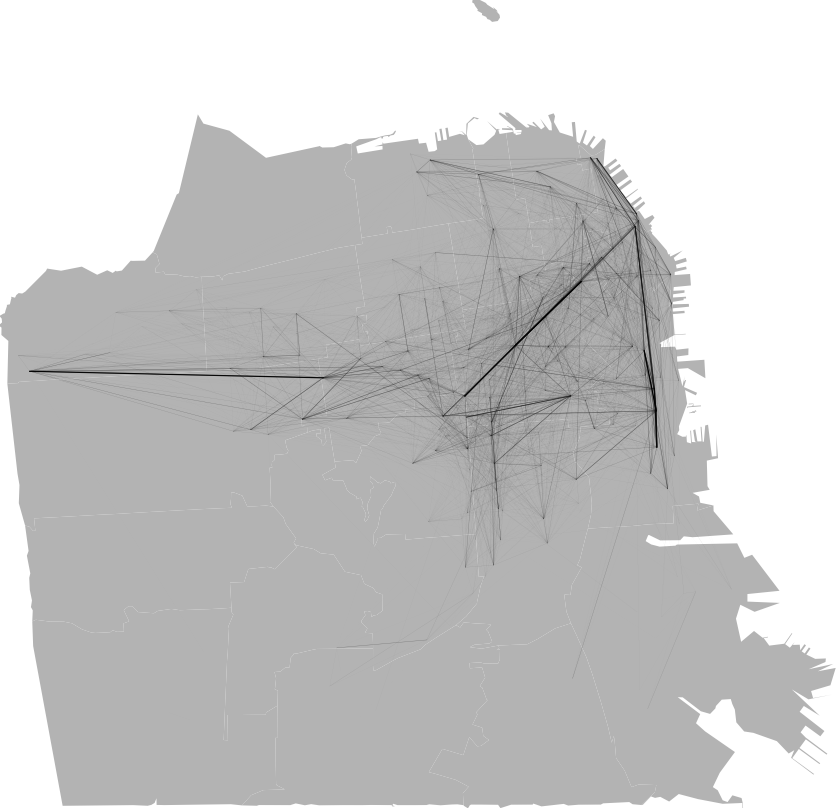
Fig. 1 shows the undirected network of valid station-to-station trips within San Francisco, with stations as nodes and trips as edges. The visualized edge width and opacity directly correspond to the number of trips between the two connected stations. Line width and opacity are linearly scaled. Edges are plotted as straight lines between stations and do not reflect any actual routes taken between stations as this information is not obtainable through open bike-share data.
The edge opacity causes overlapping edges appear darker. This creates a monochromatic pseudo-heatmap of bike-share trip traffic in effect. Though aggregation across trip edges is performed only through this visual effect, several high-volume bike-share traffic corridors can be identified: Golden Gate Park, Market St., and 3rd St.
This visualization format enables analysts and observers to familiarize themselves with areas of interest within the bike-share trip networks of unfamiliar cities. From these areas of interest, targeted analyses within the network can be performed. For our purposes however, our team analyzed the entire Bay Wheels trip network within San Francisco, which we'll explore in the next post.